Campaign: Celebrating South African
The main idea for this project was to create a visual campaign celebrating South African art and artists. I looked within my own experience as a South African.
I aimed to create a visual identity in this campaign that can be applied to any sub-culture. The subculture will be represented as a whole (South African) but yet have its distinct qualities shine through. So, even though I only chose three subcultures, they can be expanded on.
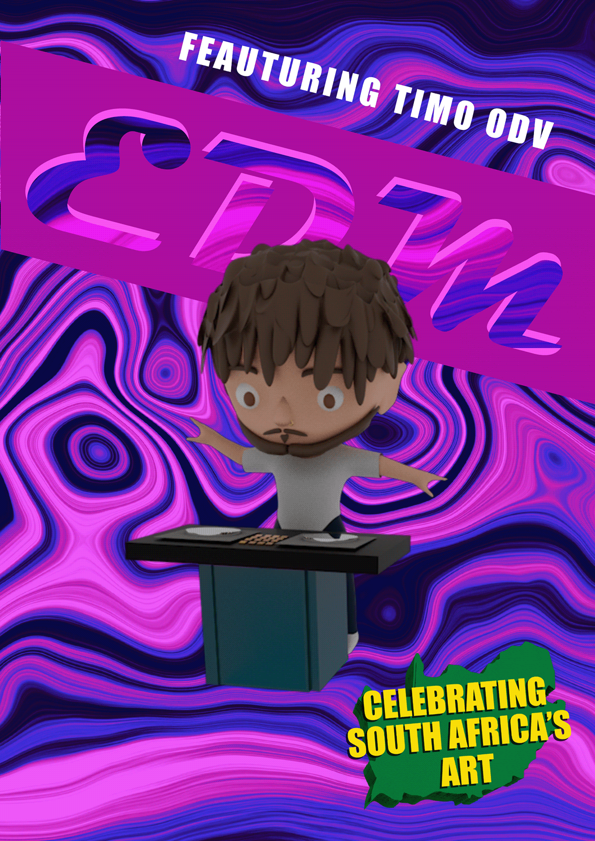
The three sub-cultures I wanted to highlight were Afrikaans rock, Hip Hop and Electronic Dance Music (Edm). I chose to represent each subculture with a significant figure in the music genre/subculture. These figures are well-known and recognisable by the majority of South Africans. However, I also chose each musician because they have impacted me personally and have sculpted my identity as a South African, and I would like to celebrate them. These figures include Francois van Coke (Afrikaans Rock), Nasty C (Hip Hop) and Timo ODV (EDM). I also considered using very different cultures to show the wide variety of South African sub-cultures successfully.
South African Icons:
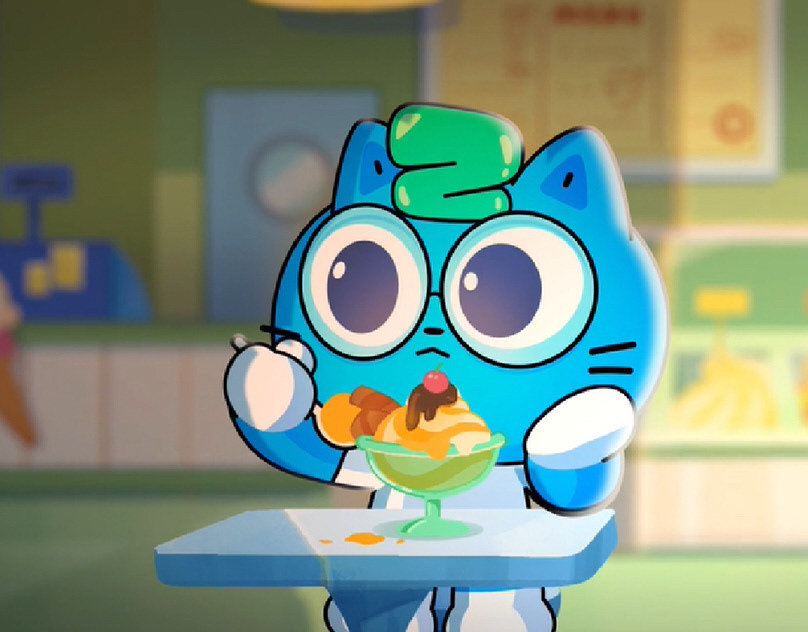
When creating these promo stings, I just started learning 3D modelling and wanted to try my hand at character modelling. For my first time creating 3D characters, I would say it's not too shabby!


Creating the campaign's visual identity:


Timelapse of creation:
Breaking it Down:
There were elements in the campaign that unified the visual identity and other elements that were entirely unique to capture the essence of each vastly different subculture successfully.
Elements that made the campaign unified:
•Composition/Layout (largely inspired by South African award-winning graphic designer Slaying Goliath)
•Movement in the animation
•3D character style
•3D campaign Logo (used as an end-screen with all three clips and colours)
•'IMPACT' typeface
•Movement in the animation
•3D character style
•3D campaign Logo (used as an end-screen with all three clips and colours)
•'IMPACT' typeface
Elements that were unique to their own subculture :
•Chosen typeface.
•Pattern designed for typography and background (also being used as a slogan)
•Colour
•Character (figures chosen to represent culture)
•Audio
•Pattern designed for typography and background (also being used as a slogan)
•Colour
•Character (figures chosen to represent culture)
•Audio
I wanted to design a pattern to use as a slogan representing the sub-culture successfully. Visual slogans are short phrases or taglines that use imagery or visual cues to communicate a brand's message. In this case, the visuals in the pattern convey so much information about the sub-culture (not a brand); in this way, it is a more effective slogan than a verbal one.
South Africa
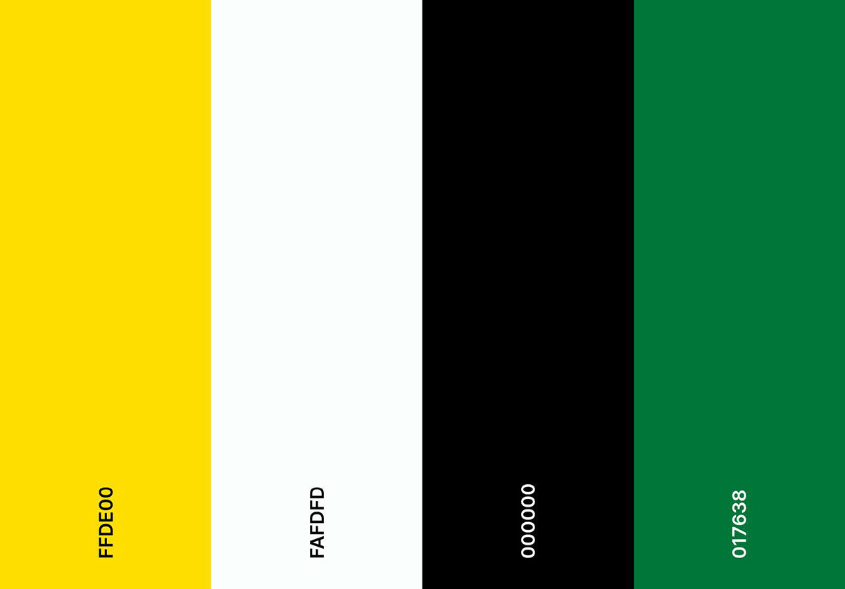
These colours were extracted from a broad South African cultural aspect. We see these colours represented in the South African flag, in the national rugby, soccer and cricket team and many more representations of South Africa. This forms the base colour that unifies the three subcultures, as all three sub-cultures fall under the South African culture umbrella. I used this colour combination in the logo of the campaign.
Green symbolises the fertility of the land, black symbolises the African community and gold (yellow) represents the country's mineral wealth.
Green symbolises the fertility of the land, black symbolises the African community and gold (yellow) represents the country's mineral wealth.
Hip Hop

The primary colour is cyan, representing the subculture of South African Hip Hop.
Cyan was chosen to represent my perception of the culture.
Cyan is a relaxing and inspiring colour that evokes images of crystal waters and is associated with liveliness, tranquillity, youth, and energy.
The Hip Hop community believes that people can use this music to take control of their lives through self-knowledge and self-expression, and that, to me, is inspiring. I believe South African Hip Hop is the forefront genre of inspiring youth and energy, and the cyan colour represents this self-expression very well.
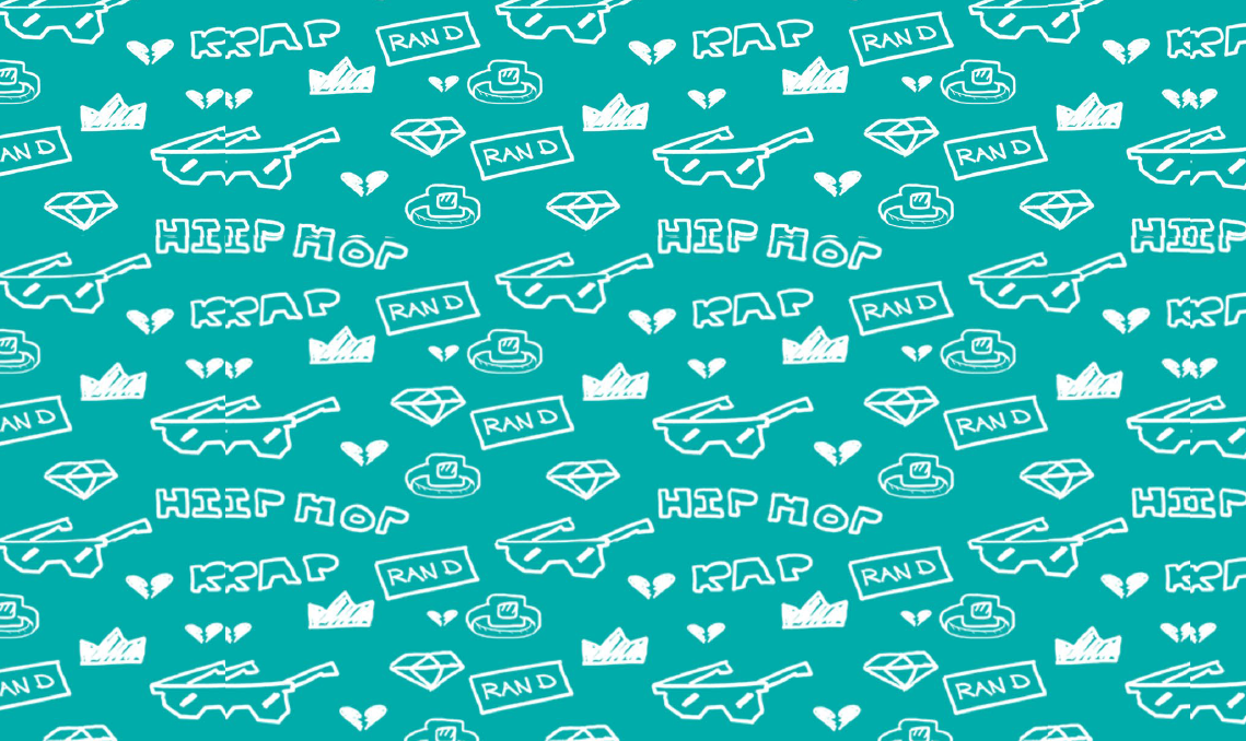
The pattern designed for Hip Hop was inspired by the classic patterns you see throughout Hip Hop culture, but I personalised it to South African Hip hop specifically.

This typeface was chosen because it was inspired by the graffiti art used throughout Hip Hop culture all over the world. However, I needed to use a more rigid typeface to successfully show the pattern through the letters, so it was counterintuitive to use a more decorative typography as the pattern designed for the word was more important than the typeface. Going too much for the graffiti look also is more of a global look for hip hop and not explicitly catering to South African hip hop.
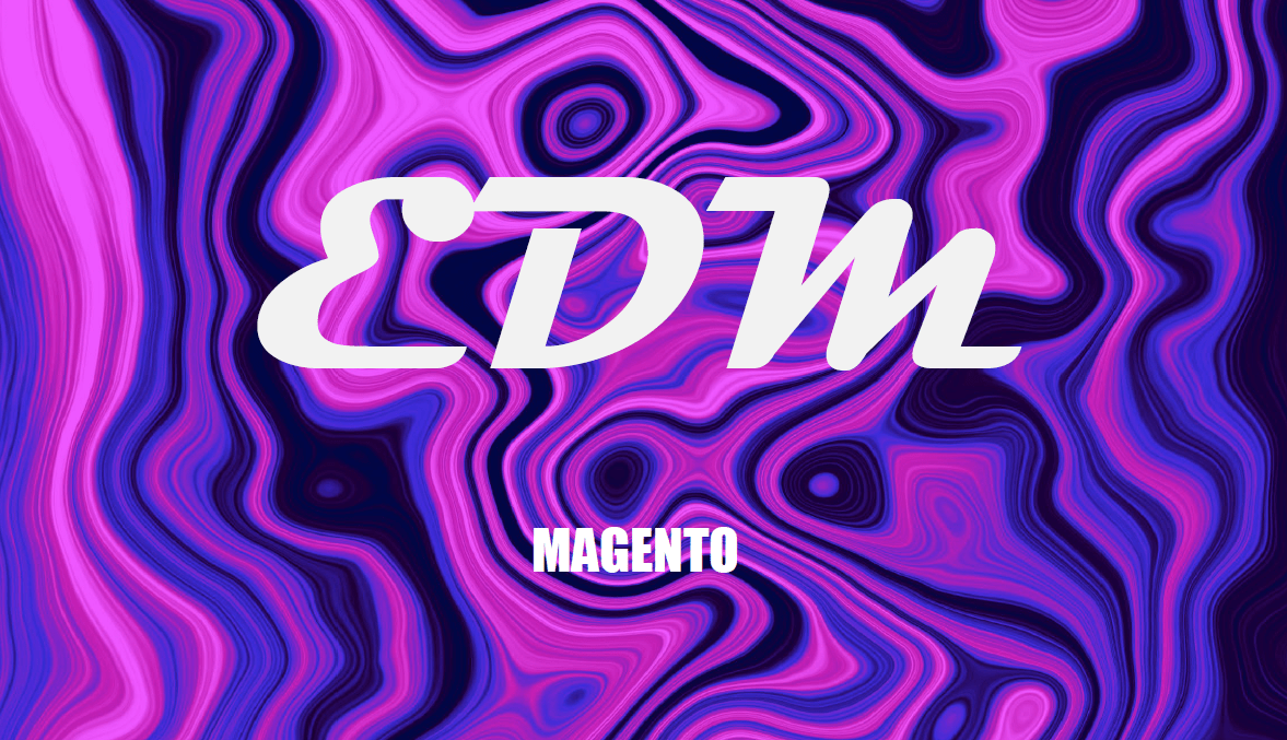
Electronic Dance Music

For the EDM subculture, I chose purple as the primary representative colour.
Interestingly enough, purple is a mixture of blue and red assigned to my other two subcultures. Thus, this colour combination creates an aesthetic colour combination when placed together.
Interestingly enough, purple is a mixture of blue and red assigned to my other two subcultures. Thus, this colour combination creates an aesthetic colour combination when placed together.
Purple is commonly associated with mysticism and magic. This colour can impart a sense of the unknown, curiosity, and mystery. Similarly, purple often inspires creativity. This aligns well with the EDM subculture as it aspires to inspire the listeners.
In another physiological sense, purple has a calming effect on the mind and body. While it is often uplifting and inspiring, the blue undertones also ensure a soothing effect is felt, lowering blood pressure and heart rate.
EDM lifts your spirits. The anticipation of the drop can increase your brain's dopamine levels, the chemical primarily responsible for making you feel good. Thus, purple is a good representation as it builds a sense of mystery and creativity (dopamine) and uplifts the mind and body through music.

The psychedelic movement inspired the EDM's pattern design, and it is a typical visual you would see at festivals.
This typeface was chosen because it represents the dance movement within the culture. It represents creativity and openness. It also reminds us of a disco theme which has the same goal as Edm which is to make listeners feel good and make them dance.
Afrikaans Rock

The primary colour chosen to represent Afrikaans rock is red.
This is because of the urgency that Afrikaans Rock makes you feel. Rock music, which developed from the folk tradition of the protest song, has been linked to political activism and racial, sexual, and drug-related social change. It is frequently seen as a manifestation of youth rebellion against adult consumerism and conformity.
Red is associated with excitement, passion, danger, energy, and action. In colour psychology, red is the most intense colour and can provoke powerful emotions. Thus, it is a perfect colour representation of Afrikaans Rock, as it was used to protest against conservative South Africa. In more recent times, it evoked strong emotions through lyrical and heavy instruments.
Not to mention that Francois van Coke's previous band name was 'Die Gevaar', meaning 'The Danger'.

The pattern used for Afrikaans Rock was inspired by the use of patterns used in Francois van Cokes' brand Fokof Lager and Fokof Bar.

This typeface was chosen because Afrikaans Rock has a rough edge to it. It is not well-rounded and does not aim to be perfect. This typeface represents this with different size letters and thicknesses at some points. The edges are rough (literally translating to the sub-culture)
Storyboards:


I am extremely proud of this project and feel I captured the essence of the subcultures accurately. This project is always a fun one to go back to. I loved creating the 3D models and am excited to broaden my scope and knowledge on 3D modelling, animation and rigging.